
Bar plots in python are one of the most used graph type for data visualization. Bar graph is type of chart but which represents the categorical data with columns or bars. Here, each bar is called as bin.

If you are a data analyst or dealing with data representation and visualizations, bar graph will be your great companion. A bar plot describes the comparisons between the discrete categories. One axis represents a category that is being compared. Now the other axis represents the measured values corresponding to those categories.
Also Read: Is Python worth learning in the year 2021?
Bar plots in Python:
A data scientist who is working in Python should have the ability to render a bar. Plot easily and quickly from data in Pandas Data Frames. This is an important skill for a data scientist. Bar plots in Python has the advantage of fast data exploration, building a story around how groups of data. They are composed and comparison of variable values between different groups. This cannot be topped by any other chart types because bar plots (or “bar charts”, “column charts”) have upper hand. As the human eye has evolved a refined ability to compare the length of objects, as opposed to angle or area.
Python users are lucky as there are plenty options for visualization libraries available for them. In addition to this, Pandas also have integration with the Matplotlib visualisation library. This allows figures to be created directly from DataFrame and Series data objects. This blog is mainly focusing on the use of the DataFrame.plot functions from the Pandas visualisation API.
Creating a bar plot:
Matplotlib in python is must for any kind of plot. Matplotlib API in Python is also one of those functions that provides bar plots in Python. The syntax for bar plot can be used by you is given below:
plt.bar(x, height, width, bottom, align)
This creates a bar blot defined by the parameters. You can just define the parameters and boom you got your bar plot with a rectangle. The parameters can be defined as follows:
| Parameters | Definition |
| height | scalar or sequence of scalars representing the height(s) of the bars. |
| x | sequence of scalars representing the x coordinates of the bars. align controls if x is the bar center (default) or left edge. |
| width | scalar or array-like, optional. the width(s) of the bars default 0.8 |
| align | {‘center’, ‘edge’}, optional, default ‘center’ |
| bottom | scalar or array-like, optional. the y coordinate(s) of the bars default None. |
Now let’s take an example of which shows how many students are enrolled in different courses of an institute.
import matplotlib.pyplot as plt


# creating the dataset
data = {'C':20, 'C++':15, 'Java':30,
        'Python':35}
courses = list(data.keys())
values = list(data.values())

fig = plt.figure(figsize = (10, 5))

# creating the bar plot
plt.bar(courses, values, color ='maroon',
        width = 0.4)

plt.xlabel("Courses offered")
plt.ylabel("No. of students enrolled")
plt.title("Students enrolled in different courses")
plt.show()
Now you can just see the result given the image below:
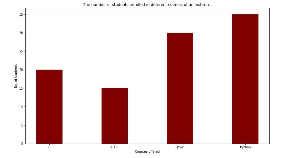
We can see here the bar plot in rectangular(courses, values, color=’maroon’). This shows that courses are plotted on the x-axis and the other values are on Y-axis. The color gives the bar plot its color as you can see it is rectangular. Now the plt.xlabel(“Courses offered”) and plt.xlabel(“students enrolled”) are used to label the corresponding axes.plt.title(). Is used to make a title for the graph.plt.show() is used to show the graph as output using the previous commands.
Bar charting numbers:
When you already know numbers that you want to display on the chart. Then the bar chart is easiest to make as there are no calculations necessary. You can make this plot simply in Pandas but by creating a Pandas “Series” and plotting the values, using the kind="bar" argument to the plotting command.
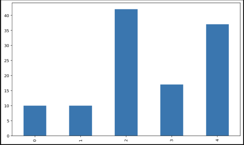
For instance, you want to make a bar chart by plotting. The number of mince pies eaten at Christmas by each member of your family. Let’s imagine you have two parents (ate 10 each), one sister (scoffed 17), one brother (ate 42) and yourself (ate 37). Now to create a chart based on this:
# Import the pandas library with the usual "pd" shortcut
import pandas as pd
# Create a Pandas series from a list of values ("[]") and plot it:
pd.Series([65, 61, 25, 22, 27]).plot(kind="bar")
You can also create a Pandas dataframe to achieve the same result:
# Create a dataframe with one column, "ages"
plotdata = pd.DataFrame({"ages": [65, 61, 25, 22, 27]})
plotdata.plot(kind="bar")
Here is the kind of bar plot that you will get as shown in the image given below:
How to Customize the bar plot:
importpandas as pdfrommatplotlib importpyplot as plt# Read CSV into pandasdata =pd.read_csv(r"cars.csv")data.head()df =pd.DataFrame(data)name =df['car'].head(12)price =df['price'].head(12)# Figure Sizefig =plt.figure(figsize =(10, 7))# Horizontal Bar Plotplt.bar(name[0:10], price[0:10])# Show Plotplt.show()
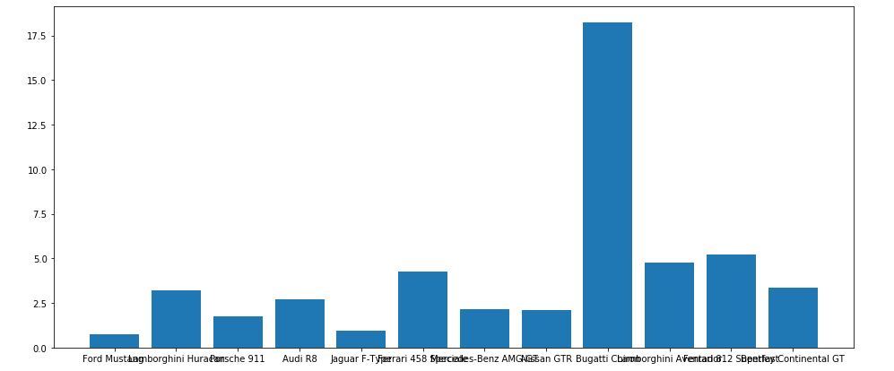
So as it can observed in the image above the X-axis ticks are overlapping each other. As you can see the they are not clearly visible which can fixed by rotating the X-ticks. Then it can clearly visible that is why customization is required.
importpandas as pdfrommatplotlib importpyplot as plt# Read CSV into pandasdata =pd.read_csv(r"cars.csv")data.head()df =pd.DataFrame(data)name =df['car'].head(12)price =df['price'].head(12)# Figure Sizefig, ax =plt.subplots(figsize =(16, 9))# Horizontal Bar Plotax.barh(name, price)# Remove axes splinesfors in['top', 'bottom', 'left', 'right']:ax.spines[s].set_visible(False)# Remove x, y Ticksax.xaxis.set_ticks_position('none')ax.yaxis.set_ticks_position('none')# Add padding between axes and labelsax.xaxis.set_tick_params(pad =5)ax.yaxis.set_tick_params(pad =10)# Add x, y gridlinesax.grid(b =True, color ='grey',linestyle ='-.', linewidth =0.5,alpha =0.2)# Show top valuesax.invert_yaxis()# Add annotation to barsfori inax.patches:plt.text(i.get_width()+0.2, i.get_y()+0.5,str(round((i.get_width()), 2)),fontsize =10, fontweight ='bold',color ='grey')# Add Plot Titleax.set_title('Sports car and their price in crore',loc ='left', )# Add Text watermarkfig.text(0.9, 0.15, 'Jeeteshgavande30', fontsize =12,color ='grey', ha ='right', va ='bottom',alpha =0.7)# Show Plotplt.show()
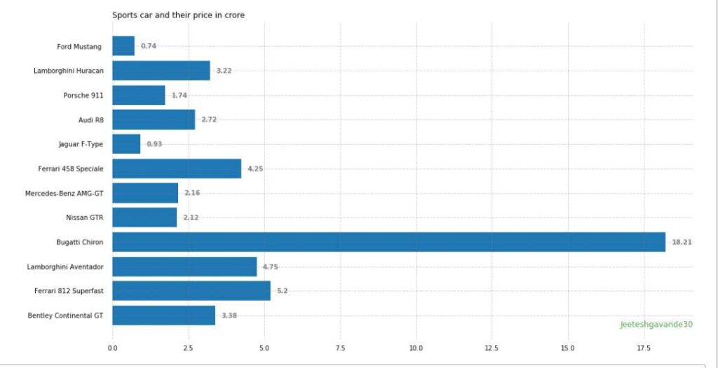
Here you can see but we have switched the sides now the graph is more understable and clearly visible.
Multiple Bar Plots:
Multiple bar plots can be used but when the comparison among the dataset is to be done. But also we can convert area bar chart, where each subgroup is displayed by one on top of the others. It can be plotted by varying the thickness and position of the bars. And also following bar plot shows the number of students passed in the engineering branch:
import numpy as np
import matplotlib.pyplot as plt

# set width of bar
barWidth = 0.25
fig = plt.subplots(figsize =(12, 8))

# set height of bar
IT = [12, 30, 1, 8, 22]
ECE = [28, 6, 16, 5, 10]
CSE = [29, 3, 24, 25, 17]

# Set position of bar on X axis
br1 = np.arange(len(IT))
br2 = [x + barWidth for x in br1]
br3 = [x + barWidth for x in br2]

# Make the plot
plt.bar(br1, IT, color ='r', width = barWidth,
        edgecolor ='grey', label ='IT')
plt.bar(br2, ECE, color ='g', width = barWidth,
        edgecolor ='grey', label ='ECE')
plt.bar(br3, CSE, color ='b', width = barWidth,
        edgecolor ='grey', label ='CSE')

# Adding Xticks
plt.xlabel('Branch', fontweight ='bold', fontsize = 15)
plt.ylabel('Students passed', fontweight ='bold', fontsize = 15)
plt.xticks([r + barWidth for r in range(len(IT))],
        ['2015', '2016', '2017', '2018', '2019'])

plt.legend()
plt.show()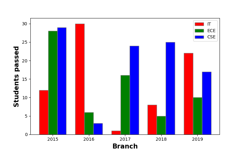
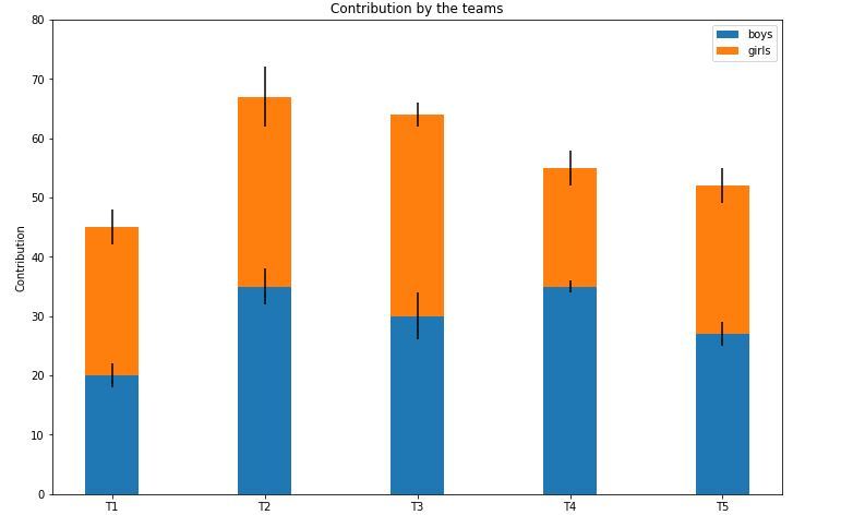
Now the stacked bar plot:
Stacked bar plots represent different groups on top of one another. The height of the bar depends on the resulting height of the combination of the results of the groups. It goes from the bottom to the value instead of going from zero to value. The following bar plot represents the contribution of boys and girls in the team.
import numpy as np
 import matplotlib.pyplot as plt
 N = 5
 boys = (20, 35, 30, 35, 27)
 girls = (25, 32, 34, 20, 25)
 boyStd = (2, 3, 4, 1, 2)
 girlStd = (3, 5, 2, 3, 3)
 ind = np.arange(N)
 width = 0.35
 fig = plt.subplots(figsize =(10, 7))
 p1 = plt.bar(ind, boys, width, yerr = boyStd)
 p2 = plt.bar(ind, girls, width,
             bottom = boys, yerr = girlStd)
 plt.ylabel('Contribution')
 plt.title('Contribution by the teams')
 plt.xticks(ind, ('T1', 'T2', 'T3', 'T4', 'T5'))
 plt.yticks(np.arange(0, 81, 10))
 plt.legend((p1[0], p2[0]), ('boys', 'girls'))
 plt.show()
Conclusion:
So we have provided you with different Bar plots in Python and also some information. You can see different types of Bar plots in Python here and some of their basic uses and how to personalize them according to your need. Hope you find what you are looking for here. Thank You for the read.