
In this post, we will solely concentrate our minds on talking about Heat Maps. The various concepts associated with Heat Maps in Python. Thus, lets begin with the topic at hand and learn to create heat maps in Python using its various efficient and specialized libraries.
What is a Heat Map?
A heat-map generally represents the values for the first variable of interest (like rainfall, temperature, or sensor data) across dual-axis variables as a grid of colored squares. The different colors in each cell indicate the value of the first variable in the corresponding cell range. Each cell reports a numeric count, like in a standard data table as correlation values. By observing the cell color variation, the patterns present can be predicted. Thus, heat maps help in finding the collinearity of the data.
Heat map is generally used to visualize event occurrences or densities. We will use the Kernel Density Estimation (KDE) algorithm in here for our heat-maps. Although, there are other kernel shapes available like the Gaussian, Triweight, Epanechnikov, Triangular, which can be used instead of KDE. For your information, there are many specialized libraries in Python which can be employed like Scikit-learn or Seaborn. We will use here, libraries like Matplotlib, NumPy and Math.
So, lets start with the task then.
Creating Heat Maps in Python
Importing the libraries we will be using for creating the heat map.
import matplotlib.pyplot as plt
import numpy as np
import math
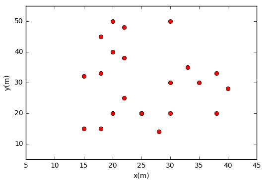
Now, for the dataset. Lets build a point dataset consisting of x,y coordinates. Therefore, we will create two lists for x and y.
x = [20,28,15,20,18,25,15,18,18,20,25,30,25,22,30,22,38,40,38,30,22,20,35,33]
y = [20,14,15,20,15,20,32,33,45,50,20,20,20,25,30,38,20,28,33,50,48,40,30,35]
Now, in creating a heat-map using KDE we have to specify radius and output grid size of the kernel. Also, we will be using mesh grid for the same. Therefore we need to find x,y min and max values to generate x,y sequence numbers which will be used for the mesh grid.
# x,y min and max
min_x = min(x)
max_x = max(x)
min_y = min(y)
max_y = max(y)

# Constructing the Mesh Grid
x_grid = np.arange(min_x - h, max_x + h, grid_size)
y_grid = np.arange(min_y - h, max_y + h, grid_size)
x_mesh,y_mesh = np.meshgrid(x_grid, y_grid)

# Now, Calculating Centre-Points
xc = x_mesh + (grid_size / 2)
yc = y_mesh + (grid_size / 2)
The KDE Function
To calculate a point density or intensity we use a function called kde_quartic. This function has two arguments: point distance(d) and kernel radius (h).
def kde_quartic(d, h):
       dn = d / h
       S = (15 / 16) * (1 - dn**2) **2
       return S
Compute Density Value for Each Grid
Now that we have completed the above steps, we need to compute the density value for each grid. We will be using three loops for the same. We will also calculate the distance of the center point to each dataset point. Using this distance, then we compute the density value of each grid with the kde_quartic function.
Lets see how we do this.
intensity_list = []
for j in range(len(xc)) :
      intensity_row=[]
      for k in range(len(xc[0])) :
            kde_value_list=[]
            for i in range(len(x)) :

# Calculating distance
            d=math.sqrt((xc[j][k]-x[i])**2+(yc[j][k]-y[i])**2)
            if d <= h :
                 s = kde_quartic(d,h)
            else :
                s = 0
            kde_value_list.append(s)

# Summing the Intensity Values
           s_total=sum(kde_value_list)
           intensity_row.append(s_total)
 intensity_list.append(intensity_row)
Now, over to the last part, the final visualizing part. We will be using the Matplotlib library to visualize the Heat Map.
intensity = np.array(intensity_list)
plt.pcolormesh(x_mesh, y_mesh, intensity)
plt.plot(x, y, 'ro')
plt.colorbar()
plt.show()

To know more about the other applications of Matplotlib library take a look in here.
Miscellaneous Examples
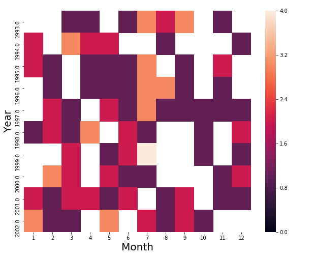
Now, lets create a heat map for comparison of the top 10 years in which the UFO was sighted vs each Month.
import pandas as pd
import matplotlib.pyplot as plt
import seaborn as sns
#Source: https://bit.ly/1l9yjm9
df = pd.read_csv(r'ufo.csv')
df['Date_time'] = df['Date_time'].astype('datetime64[ns]')
most_sightings_years = df['Date_time'].dt.year.value_counts().head(10)
def is_top_years(year):
   if year in most_sightings_years.index:
       return year
month_vs_year = df.pivot_table(columns=df['Date_time'].dt.month,index=df['Date_time'].dt.year.apply(is_top_years),aggfunc='count',values='city')
month_vs_year.columns = month_vs_year.columns.astype(int)
print("\n Creating Heat-map for comparison of top 10 years in which UFO was sighted vs each month : ")
plt.figure(figsize=(10,8))
ax = sns.heatmap(month_vs_year, vmin=0, vmax=4)
ax.set_xlabel('Month').set_size(20)
ax.set_ylabel('Year').set_size(20)
Creating Heat-map for comparison of top 10 years in which UFO was sighted vs each month :
CLOSING UP
Through this post, we have got ourselves acquaint with various topics like, the different Python algorithms and libraries to use for creating heat maps in Python. Also, here, we have used the KDE algorithm and the libraries like Matplotlib, Pandas, NumPy and the Math module. We have used different datasets also for the same. One thing that you can further do is build up on the code provided and try out the other algorithms and libraries also. Thus with this, I suppose and hope that the topic at hand is quite clear to you. Since, we have covered the topic in great depth with the help of ample interesting examples.